Accessibility Guidelines
Introduction
Accessibility means access. It refers to the ability for everyone, regardless of disability or special needs, to access, use and benefit from everything within their environment. It is the “degree to which a product, device, service, or environment is available to as many people as possible.”
Accessibility is one of the most important aspects of modern web development. Users of all types will have a better experience if you take accessibility concerns into account. It is also required by law for all federal EIT products to be accessible (with a few minor exceptions). 2U is dedicated to meeting WCAG AA standards and is in the process of bringing our inbound marketing sites up to spec.
While these guidelines reflect what the Web Production team looks out for, accessibility is a multi-faceted approach requiring teamwork from multiple stakeholders like you! By adhering to the principles of accessibility, it will not only ensure that our websites are accessible, but also result in beautiful, logically laid out content with a good user experience for everyone!
Quick Links
Navigation Elements
Top Navigation
All pages should be in the dropdown nav. Ensure all pages (including subpages) fall under the top navigation bar.
Some pages may be excluded such as such as pages that are hidden from the sitemap such as thank you pages, course pages, event pages, individual faculty profiles, and 2U partner pages or blogs that appear in the footer.
Breadcrumbs
Breadcrumbs should appear on all pages with the exception of very specific, justifiable use cases such as pages that are hidden from the sitemap/fall outside the site structure. Please reach out to Web Prod or SEO if you are unsure about exclusions.
Side Navigation
Pages with a side navigation should include all pages in its section and match the top dropdown nav. There are specific exceptions to this rule (ie. fluid width pages, thank you pages, form pages, RSVP pages) which commonly lack a side navigation.
Page Headers/Titles
At its core, each web page should be organized like a Harvard outline. The first header that shows up on the page (a H1, or Header 1) should be the broadest topic, encompassing everything that the subsequent sub headers cover. By thinking of a page’s content like an outline, it will help to check whether or not ideas are presented in a clear and logical order to the user. For instance, if a H3 has nothing to do with the H2 that it falls under, reconsider if it should really be a H3.
Page Header Structure
On each page, the H1 should be the first content element. Following the H1, subheaders must follow sequential order forward (H2, H3, H4, and so on).
Header Overrides
Although maintaining correct header structure is a must for accessibility, there will be rare cases when a header will need to look different than its default Whitelabel settings (ie. a H2 needs to look like a H4). We call this a “header override.” This way, we can keep correct semantic order (a H2 can look like a H4 but it is still listed as a H2 on the outline). This should be done as sparingly as possible and is only for design-heavy pages such as homepages, OLPs, and other high-converting pages.
User Experience
Subheaders (h2, h3 etc) convey important information to the user, such as how to interpret the content and understand how it’s organized in relation to which header it falls under. An h3 subheader will relate to the h2 subheader which comes before creating a recognizable and predictable visual hierarchy. For users to understand these subheaders, it’s important to keep preset subheader font sizes, font weights, and colors consistent.
Page Titles
Page titles, breadcrumbs, and navigation menu titles should all be consistent and match closely enough so that a user knows they are going to the page they clicked the link for.
Copy
Meet Minimum Color Contrast Ratios
Ensure text and background have sufficient contrast ratios. We follow AA standards, which means a minimum contrast ratio of a 4.5:1 for normal text and 3:1 for large text (defined as 24px or larger OR if bolded, 18.66px or larger). Use WebAim’s online tool to check contrast ratios.
Keep in mind that not all color combinations from Whitelabel pass the color contrast ratio minimums, so double checking that they are accessible with the WebAim tool is encouraged.
Email Addresses
We cannot link URLs, including email addresses. Email links should be consistent. Either hyperlink the words “Email us” as a mailto link OR type out the email address without linking it.
Good example: “Email us at foo@bar.com” OR “Email us”.
You cannot use “Email Us” multiple times on a page for different email addresses. For example, you may link “Email Us” to an admissions email address, but if there is also a link to email Financial Aid, that link text must be unique or just have the unlinked email address.
Bad example: “Email us at foo@bar.com.”
Descriptive Link Text
Linked text must be descriptive and unique, as some screen reading software does not necessarily list links in context.
Good example: ‘More information on our immersion programs’ is accessible because it lets the user know that if you click on the link, you will receive more information about immersion programs.
Bad example: ‘More information” on our immersion programs is not accessible because the user cannot reasonably expect to know where the the hyperlink would link out to if using a screen reader or what kind of information they will be receiving.
Button CTA Language
Any buttons that link to other pages should have descriptive link text. “Learn More/Request Information” should be reserved for buttons that display the lead form.
Unique Characters
Do not include decorative characters (i.e. >> or * ) in your links. These are not interpreted correctly by screen readers and are not accessible.
Phone numbers
Formatting should be consistent (body, header, footer) – use only numbers. No letters can be used in phone number including phonewords.
Media Elements
Video Embeds
- Video captioning is required: Ensure all videos on our sites have captions via 3PlayMedia, when they are hosted by us (Vimeo, Youtube, etc). If there are videos not owned by us, we need to determine if captioning is available.
- No autoplaying videos: User needs to press play in order to watch video.
- Do not hide player controls.
- No small video players: We cannot add videos to a widget that is too small to read captions.
Images
- Text over image: Text over images should be selectable text, rather than part of the image. Text as a part of the image is discouraged, since the text does not scale appropriately with zoom tools. Please discuss with a web producer about if the text can be coded as HTML to overlay the image instead of as part of the image. If the text must stay on the image, the same text should be included elsewhere on the page such as a description.
- Alternative text: If an image is used on a page to provide information or convey meaning versus just being decorative, alternative text (“alt text”) or captions for the image should be provided.
- Linked images and text: Screen readers need to perceive a linked image and accompanying text as a single unit.
- Color as visual cue: Something other than color must be used to distinguish content.
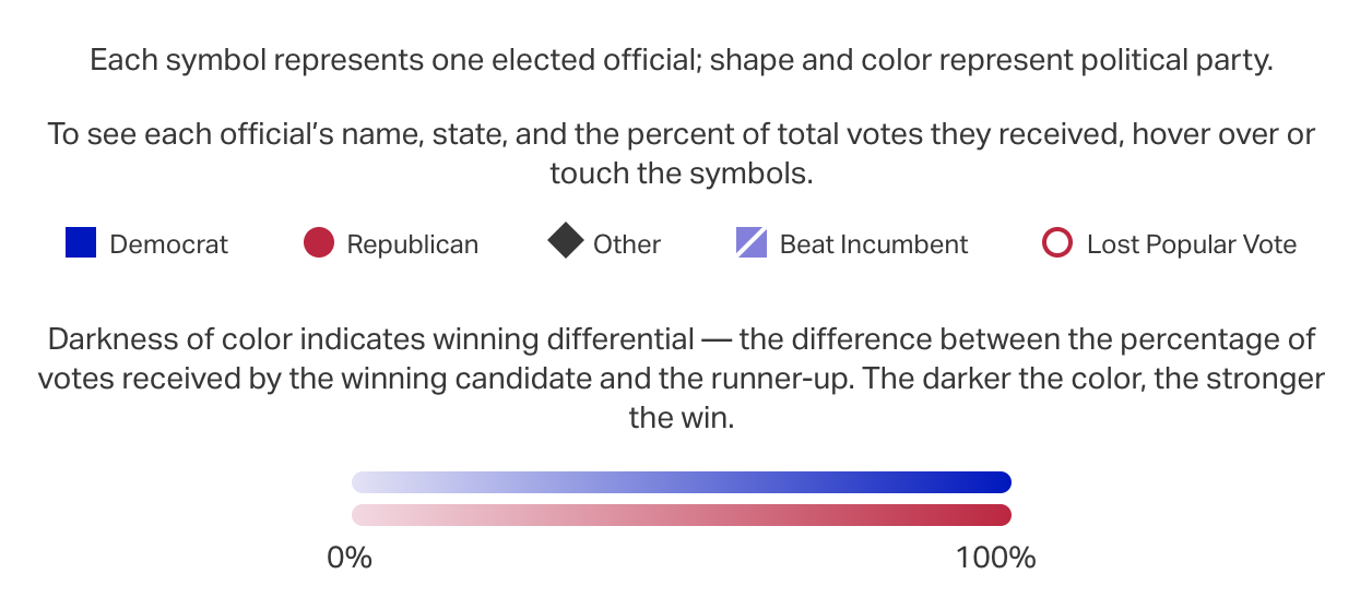
In this infographic legend, shapes as well as colors are used to distinguish content within the same data set.
Infographics
All infographics must come with an accessible, plain text transcript that is logically laid out. This plain-text version of the graphic must be created as a raw page and linked below the image. See an example of a text-only page here.
As with most other links, avoid using language like “click here” or “link to” when linking out the transcript, as this language is not necessarily accessible. Webaim goes more in depth about best practices on link text and appearance. This also pertains to interactive graphics with rollover effects.
Tables
- Column header markup: Each column should have a header.
- No empty cells: Every cell should be filled out.
- Formatting: Tables should only be used to organize data. Do not use tables for design.