Accessibility Guidelines
Introduction
Accessibility means access. It refers to the ability for everyone, regardless of disability or special needs, to access, use and benefit from everything within their environment. It is the “degree to which a product, device, service, or environment is available to as many people as possible.”
Accessibility is one of the most important aspects of modern web development. Users of all types will have a better experience if you take accessibility concerns into account. It is also required by law for all federal EIT products to be accessible (with a few minor exceptions). 2U is dedicated to meeting WCAG AA standards and is in the process of bringing our inbound marketing sites up to spec.
While these guidelines reflect what the Web Production team looks out for, accessibility is a multi-faceted approach requiring teamwork from multiple stakeholders like you! By adhering to the principles of accessibility, it will not only ensure that our websites are accessible, but also result in beautiful, logically laid out content with a good user experience for everyone.
Navigation
Navigation Elements
- Top Navigation: All pages should be in the dropdown nav. Ensure all pages (including subpages) fall under the top navigation bar.
- However, some pages may be excluded such as pages that are hidden from the sitemap like thank you pages, course pages, event pages, individual faculty profiles, and 2U partner pages or blogs that appear in the footer.
- Breadcrumb Display: We should have breadcrumbs on all pages except in very specific, justifiable use cases (such as pages that are hidden from the sitemap/fall outside the site structure like thank you pages).
- Side Navigation: Pages with a side navigation should include all pages in its section. There are specific exceptions to this rule (ie. fluid width pages, thank you pages, form pages, RSVP pages) which commonly lack a side navigation.
Page Headers/Titles
At its core, each web page should be organized like a Harvard outline. The first header that shows up on the page (a H1, or Header 1) should be the broadest topic, encompassing everything that the subsequent sub headers cover. By thinking of a page’s content like an outline, it will help to check whether or not ideas are presented in a clear and logical order to the user. For instance, if a H3 has nothing to do with the H2 that it falls under, reconsider if it should really be a H3.
Page Header structure
- On each page, the H1 should be the first element in the main content area. There should only be one H1 in the main content area of the page.
- Following the H1, subheaders must follow sequential order forward (H2, H3, H4, and so on).
- The photo below is an example of the proper header structure:

Please note that you can jump from a H4 to a H2 with the completion of one topic to the start of a new topic. This can be see in the photo below:

How to check for accessible header structure:
- Install the Web Developer Tool.
- Click on icon in browser to open tool.
- Click on “View Document Outline” to see page header structure.
- Please note that the Leadform Header will display as an h1 in the document outline, so you will see multiple h1’s on the page, which is okay. In addition, the GDPR/onetrust banners may appear as well.
- Fix accordingly by making sure the header tags follow correct semantic order and use header override classes (ex: h2 class=”h3″) where necessary.
For an in depth guide on how to use the Web Developer tool, refer to our Web Developer Extension Tool documentation page.
Header Overrides
Although maintaining correct header structure is a must for accessibility, there will be rare cases when a header will need to look different than its default Whitelabel settings (ie. a H2 needs to look like a H4). We call this a header override. This way, we can keep correct semantic order (a H2 can look like a H4 but it is still listed as a H2 on the outline). This should be done as sparingly as possible and is only for design-heavy pages such as homepages,OLPs, and other high-converting pages.
User Experience
Subheaders (h2, h3 etc) convey important information to the user, such as how to interpret the content and understand how it’s organized in relation to which header it falls under. An h3 subheader will relate to the h2 subheader which comes before creating a recognizable and predictable visual hierarchy. For users to understand these subheaders, it’s important to keep preset subheader font sizes, font weights, and colors consistent.
Page Titles
- Page titles, breadcrumbs, and navigation menu titles should all be consistent. Page title should be the similar/include the same keyword as the nav item. They should match closely enough so that a user knows they are going to the page they clicked the link for.
- Multiple pages should not use the same name – we need to distinguish between pages, even if they are within different sections on one site.
- Allowable: Both MPH Admissions and MBA Admissions live on the @Simmons website and both are titled with an h1 as “Admissions Overview”, but since the “title of each page is different and distinguishable (as can be viewed by the tabs in the browser and sitemap) it is okay.
- Allowable: MAT Admissions page and EdD Admissions page have the same H1 but have different program qualifiers (such as “MAT Admissions” vs. “EdD Admissions”) in the sitemap so there is sufficient differentiation.
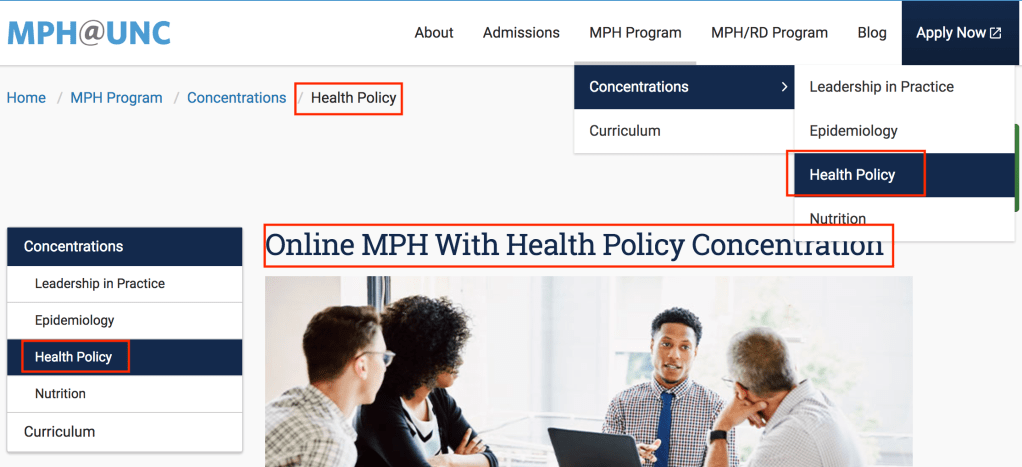
Examples of proper navigation and page title formatting can be seen in the following photo:
- Sidebar headers in sideblock (below side navigation)
- Sidebar elements display before the H1 in the page structure. To maintain semantic structure, any sidebar elements that display designed as a header should use a div class instead of a header class. Instead of h3, use div class=”h3″.
Copy
- Meet minimum color contrast ratios: Ensure text and background have sufficient contrast ratios. We follow AA standards, which means a minimum contrast ratio of at 4.5:1 for normal text and 3:1 for large text (defined as 24px or larger OR if bolded, 18.66px or larger). Use WebAim’s online tool to check your contrast ratios.
- Do not edit the appearance of link text unless it is necessary to ensure it meets minimum color contrast ratios.
- Do not link spelled out email addresses: Email links should be consistent. Either hyperlink the words “Email us” as a mailto link OR type out the email address, but do not link it.
- Good example: “Email us at foo@bar.com” OR “Email Us”
- You cannot use “Email Us” multiple times on a page for different email addresses. For example, you may link “Email Us” to an admissions email address, but if there is also a link to email Financial Aid, that link text must be unique or just have the unlinked email address.
- Bad example: Email us at foo@bar.
- Good example: “Email us at foo@bar.com” OR “Email Us”
- Descriptive link text: Links should never contain a full URL. Linked text must be descriptive and unique, as some screenreading software does not necessarily list links in context.
- Good example: “More information on our immersion programs” is accessible because it lets the user know that if you click on the link, you will receive more information about immersion programs.
- Bad example: ‘“More information” on our immersion programs’ is not accessible because the user cannot reasonably expect to know where the hyperlink would link out to if using a screenreader or what kind of information they will be receiving.
- Avoid linking with language like “Click here” and “Link to”.
- Note: our CTAs for the lead form are not technically acceptable descriptive link text, but the business value has dictated the copy we must use for them.
- Button CTA language: Any buttons that link to other pages should have descriptive link text. “Learn More/Request Information” should be reserved for buttons that display the lead form.
- Unique characters: Do not include decorative characters (i.e. ‘>>’ or ‘*’ ) in your links. These are not interpreted correctly by screen readers and are not accessible.
- Phone numbers: formatting should be consistent (body, header, footer) – use only numbers. No letters can be used in phone number including phonewords.
Media Elements
Video Embeds
Any and all videos added to our sites must already be captioned. We use 3PlayMedia to add captions to our videos. In order to use 3PlayMedia’s captioning services, we must have ownership of the videos. We are unable to embed videos without captions – we can only externally link out to an uncaptioned video.
If the video is not owned by us, they will still need to be captioned if they are to be used on our sites. Keep in mind that auto-generated captions do not count as captioning because they are inaccurate.
View our instructions to caption videos using 3PlayMedia here.
- No autoplaying videos: User needs to press play in order to watch video.
- Add code for proper video formatting: Add ?wmode=transparent&rel=0 to the end of the video url to ensure that the video does not go on top of the modal lead form.
- Ex: https://www.youtube.com/embed/oSdgBnGtAQw?wmode=transparent&rel=0.
- Note: if you are adding other parameters, you can add this to the end using ? for the first parameter, and & to separate each additional parameter (&wmode=transparent&rel=0).
- Do not hide player controls.
- No small video players: Do not add videos to a widget that is too small to read captions for both desktop and mobile.
- iFrames: All iFrames must have a title attribute that describes the video.
- Video Embed code snippet: View the Video Embed code snippet for proper way to insert video onto a page.
Images
- Text over image: Text over images should be selectable text, rather than part of the image. Text as a part of the image is discouraged since the text cannot scale appropriately with zoom tools.
- First, request that the text be taken off and code it as html if possible. If this cannot be avoided, it is important to make sure the alt text effectively describes the textual element correctly. In addition, the same text should be included elsewhere on the page.
- Alt text: Images should only have alt text in certain cases, such as when text is part of the image. Decorative images do not need alt text and should use a null value of alt=””. Refer to w3’s alt tag decision tree for more information.
- Linked images and text: Screen readers need to perceive a linked image and accompanying text as a single unit. We need to avoid having repetitive links (when a headline/image/copy all links to the same URL). This can be accomplished in two ways:
- Hard-coded HTML Block Link: View the block link code snippet for proper way to code a widget/header/image/copy as one single link.
- An example of the hand-coded block link can be found here.
- Cask Widget Settings: Cask has a feature in the widget settings which allows for a link to be added to the entire HTML block. This method of linking a widget only works for relative URLs. However, this method for linking image and text single units is outdated, and the hard-coded method is used more frequently.
- Hard-coded HTML Block Link: View the block link code snippet for proper way to code a widget/header/image/copy as one single link.
- Social Icon Naming: Consistent naming/coding of social icons. When manually adding social icons, use a href title=“What handle/org] on [which social media site] (external link)”
- Example: USC Rossier About page
Infographics
- Text transcript: All infographics must come with an accessible, plain text transcript that is logically laid out. This plain-text version of the graphic must be created as a raw page and linked below the image.
- Example: In this infographic, which details the dangerous chemicals found in fast food, a link is provided to the text-only version of the infographic below.
Tables
- Caption (description): ensure tables are set up semantically, and have captions that sufficiently describe what kind of data the table is showing. Add a caption attribute to each table.
- Column header markup: Each column needs a respective column header. The scope attribute of ‘col’ must be added to all table column headers.
- No empty cells: Every cell should be filled out.
- Do not use tables for design. Tables must only be used for their intended purpose of displaying information – not for design purposes.
- Refer to the Responsive table code snippet for proper way to code a table.: