Images

Images are important elements of many webpages. They can convey branding and add emotional appeal to a page. However, they consume dramatically more data than other page elements like text and tables, so they should be used with consideration. This section contains resources to help make informed decisions when creating images for, and implementing images into, webpages.

Image sizes

For consistency and ease of communication, we’ve defined a set of three standard image sizes to be provided to us for every common image instance on our sites. No matter how large the image appears on the site, you can always provide the image files to us at these sizes. They should hopefully be easy to remember and will – when combined using the Picture Element – look good on every screen.

The three image sizes we ask for are:

  • 440 pixels wide (under 50 kilobytes)
  • 767 pixels wide (under 80 kilobytes)
  • 1440 pixels wide (under 140 kilobytes)

As a guideline, a page’s total image weight should not exceed 500Kb—because beyond that, images will cause a noticeable delay in a page’s loading time. It’s crucial that every image is optimized as much as possible without visibly reducing its quality.

Image Size Examples

Hero/Fluid-Width Images

These images usually adorn the tops of homepages and OLPS. They will always fill the screen from edge-to-edge, even if they have to stretch out. Be sure to resize your browser window to see how the images change at different screen sizes.

Image files should be provided at 440 pixels wide, 767 pixels wide, and 1440 pixels wide.

Full-Width Images

These large images will fill the full width of the content area of the page, but they won’t stretch to stick to the edges of large screens. Be sure to resize your browser to see how the image switches between three different sizes at different breakpoints.

Image files should be provided at all three standard sizes for full-width images: 440 pixels wide, 767 pixels wide, and 1440 pixels wide.

Sidebar Hero Images

These images live at the tops of interior pages which have sidebar navigation. With the sidebar taking up some of the screen space, the hero doesn’t get as large as a fluid-width or full-width hero would. Be sure to resize your browser to see how the image switches between different sizes at different breakpoints.

Image files should be provided at 440 pixels wide and 767 pixels wide.

Half-Width Fluid Images

These Images are common on homepages and OLPs, as they combine imagery with text for an informative and visually appealing design. Be sure to resize your browser to see how this content responsively reorganizes and the image changes resolutions based on breakpoints.

Image files should be provided at 767 pixels wide , when it’s half-width.

Half-Width Images

background image tablet

Images like this appear on homepage and OLPs, often to show two important elements side-by-side. Be sure to resize your browser to see how the image resolutions change at different breakpoints.

Image files should be provided at 767 pixels wide and will resize for mobile accordingly.

One-Third-Width Images

background image mobile

These images are often found on homepages and OLPs in order to display three equally-important things. Be sure to resize your browser to see how they transition from 440 pixels wide on mobile up to 767 pixels wide, then when they reorganize to each be one-third-width, they go back down to 440 pixels wide.

Image files should be provided at 440 pixels wide.

One-Fourth-Width Images

background image mobile

These images add visual appeal to what might otherwise be a list of four items. Their organization is very dynamic, so be sure to resize your browser to see how they rearrange multiple times and change resolutions at different breakpoints. Image files should be provided at 440 pixels wide.

Faculty Image Sizes

299 pixels wide by 238 pixels high (under 30 kilobytes)

Headshot images for faculty members should be exactly 299 pixels in width by 238 pixels in height to keep the grid structure of the faculty and leadership pages.

How to Optimize Images

The creative team will be optimizing images, but it’s useful for us to know how to direct them if needed.

Image Optimization Tips

Since images significantly add to the weight of the page, which will increase page load times for users, we want to minimize the number of images that are being requested from the server. So it’s important to ask whether the image is adding value to the site.

  • Image Reduction
  • ImageOptim
  • Blur unimportant areas of JPEGs
  • Use PNGs for images with minimal colors
  • Use JPEGs for photos
  • Additional Resoures

Image Reduction

Remove images that do not add value to the user experience. This is the best and easiest way to lower the size of our sites.

ImageOptim

ImageOptim is a free desktop application that reduces file sizes and removes metadata from files.

In the example above, a simple one color png logo was run through ImageOptim with a 56.5% reduction in file size.

Blur unimportant areas of JPEGs

Because of the way the JPEG algorithm compresses images, blurring backgrounds of images in a photo editor reduces the file size of images significantly.

Use PNGs for images with minimal colors

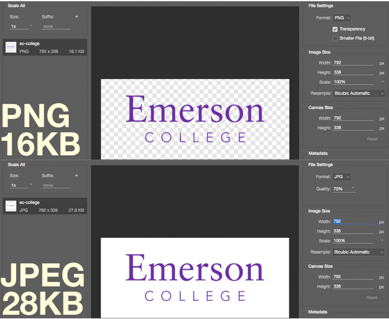
PNGs are best for logos and designs with minimal colors and is the best way to display a transparent image.

As you can see in the example above, the same image using PNGs for logos and simple graphics can save almost 50% (and retain transparency).

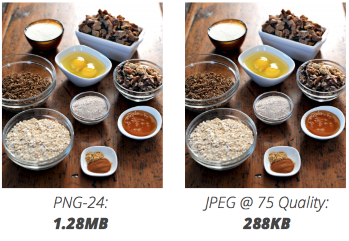
Use JPEGs for photos

In the image above, you can see how choosing a JPEG over PNG results in much lower file size.

Additional Resources

PageSpeed Insights: Analyzes sites and makes suggestions to make pages faster.

Design for Performance Slidedeck: Covers enhancements that can be done to achieve faster load times.

Design Decisions through the Lens of Performance: Covers the concept of a page load budget.