Using the Inspector
Every web browser has a tool called an inspector which is very useful for web developers to inspect the code that constitutes a webpage. It provides a view into a page’s HTML (structural elements) and CSS (styling code) and is crucial for debugging pages as well as quickly experimenting because the inspector can be used to make on-the-fly code changes to a page. These changes disappear when you reload the page, though, so they’re not going to break anything for other users.
Using the Inspector to View Mobile Webpages
Even if you don’t know HTML, the inspector can be very useful for seeing what a webpage looks like on different devices, specifically mobile devices. In the following section, I’ll show you how to use Google Chrome to see how a page looks on various popular mobile devices.
Step 1: Open Chrome
We’re off to a strong start! But really, these instructions won’t directly apply to other browsers.
Step 2: Open the inspector
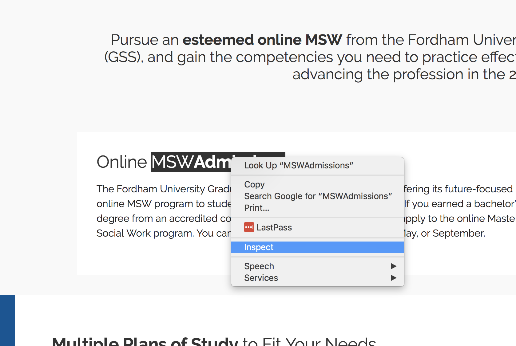
Navigate to your desired webpage, pick a page element that you want to inspect (a headline, paragraph, or image, for example), and right-click that element. Then click “Inspect” on the context menu that pops up. This will open the inspector.
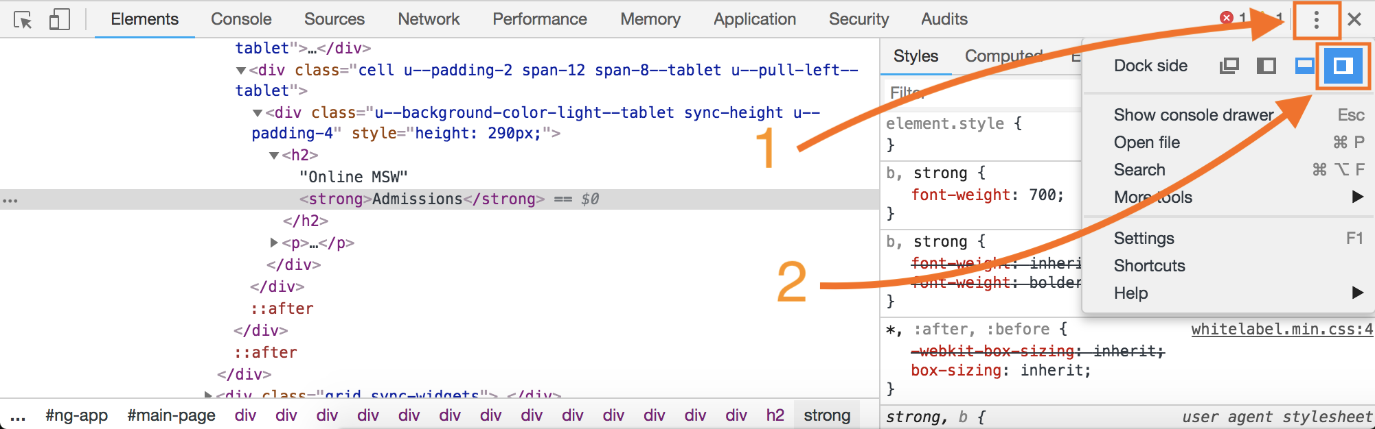
Step 3: Format your inspector
When your inspector opens, it may either be placed along the side of your browser or along the bottom. For this exercise we’ll place it on the right side. To do so, click the vertical-three-dot icon in the top-right corner of the inspector, then click the “Dock to right” icon that appears below it.
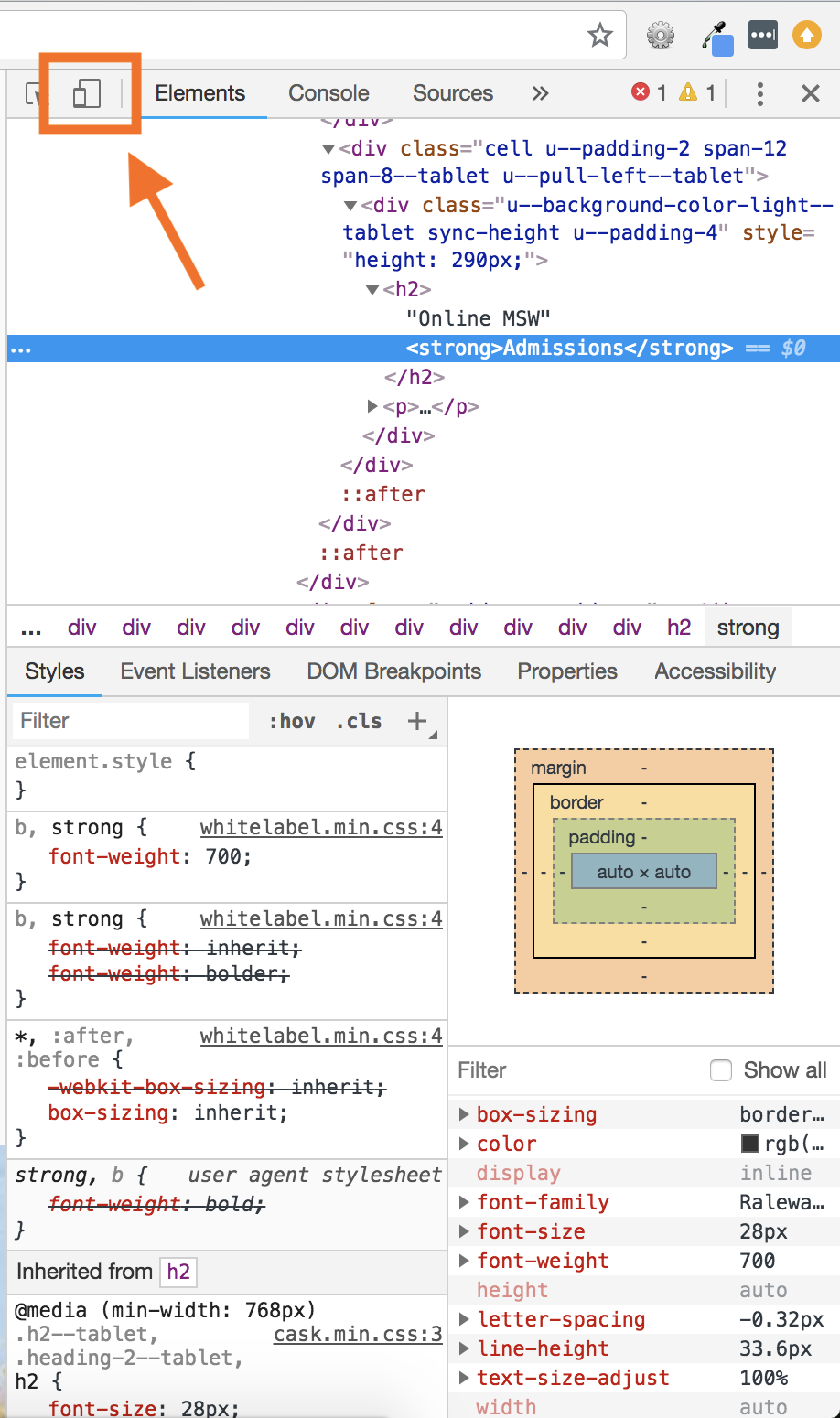
Step 4: View the mobile version
Now that your inspector window is on the right side of the browser, click the “Toggle device toolbar” icon in the top-left side of the inspector to view the webpage as if you were using a mobile device. This will squeeze all the page content into a phone-sized area and render it exactly as a mobile device would.
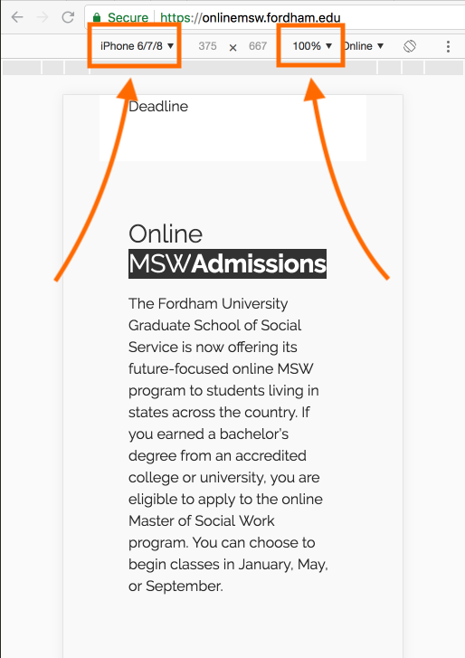
Step 5: Pick your device
Once you’re in the mobile view, you can toggle between most major mobile devices, including phones and tablets. It’s super useful to get a preview of how the page will look on any screen. To toggle between devices, click on the button in the top-center of the preview window which has a device name on it. It might say “iPhone 6/7/8” or “Galaxy S5”. Clicking on this button will open a dropdown menu of devices to choose from.
Note: If things look funky, try refreshing the page. Also make sure your zoom is set to 100%. This will be listed right next to your device selection. If it says 25%, for example, click on it to open a dropdown and select 100%.